Work / Cruise design system
One system. Two brands.
A foundation built
for reuse.
Two sister cruise brands were using many of the same product patterns, but over time their interfaces had become inconsistent across web, mobile, and onboard experiences.
I helped restructure the shared design system so teams could reuse the same foundations and components while still preserving each
brand’s identity.
KEY OUTCOMES
COMPONENT REUSE
34% → 82%
Increased adoption of shared components across product experiences.
UI QA BUG BACKLOG
45%
Reduced outstanding UI defects through greater implementation consistency.
OVERALL
100+ Components
Established a shared design language that improved consistency, and reduced artifact discrepancies.


ROLE
Experience Designer – Senior Associate
TIMELINE
January – March 2025
CONTRIBUTION
Framing · interviews · interaction design · prototyping · accessibility · stakeholder/CX review · grooming · handoff · QA · post-release learning.

01 - Two-minute version
A shared design system
built for consistency, flexibility & scale
PROBLEM
Similar journeys had drifted across products and brands, creating duplicated components, inconsistent UI, and more design and development effort.
OUTCOME
Component reuse increased from 34% to 82%, while design-related QA backlog dropped by 45%.
MOVE
Reworked the system around shared foundations, semantic tokens, reusable components, responsive rules, and brand themes.
CONSTRAINTS
Two distinct brands, existing product journeys, multiple devices, accessibility requirements, and the need to improve consistency without changing underlying business logic.

02 - SEE THE SYSTEM IN ACTION
Switch the theme. Change the screen.
Keep the system.
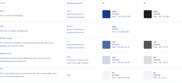
To make the system easier to understand, I created an interactive demo that lets you switch between themes and viewports and see the same product respond in real time.
A short description about out this section.
03 - CONTEXT
Products were growing faster than
the systems underneath them
The two cruise brands shared many of the same digital journeys.
But their interfaces had evolved over time across different teams, products, and devices.
This created inconsistent buttons, spacing, typography, components, accessibility, and duplicated patterns.
Individually, these issues looked small.
Across an entire ecosystem, they added up to
slower work and more UI defects.

04 - CHALLENGE
Create consistency
without making both brands look the same
The goal was not to merge the two brands visually.
Each still needed its own identity.
The challenge was:
How do we create one reusable system without flattening two distinct brands into one?

05 - AUDIT
First we tried to uncover
what already existed
We started by auditing the existing product ecosystem rather than immediately creating new components.
Our research included:

Heuristic UI reviews
and screen mapping

Accessibility
and contrast checks

Stakeholder reviews with brands, engineering, and QA teams
We compared similar interfaces across both brands and looked for repeated patterns, unnecessary variation, and gaps in the existing system.
06 - KEY FINDINGS
The biggest problem was not missing components.
It was inconsistency.
Several patterns kept appearing.
Too many versions of the same thing
Similar buttons, inputs, cards, and states had been recreated in slightly different ways.
01
Weak hierarchy
Spacing and typography were inconsistent, making some screens feel dense or harder to scan.
02
No clear theming model
Supporting two brands often meant creating separate versions instead of applying brand differences through shared rules.
04
No clear theming model
Supporting two brands often meant creating separate versions instead of applying brand differences through shared rules.
04
Documentation was fragmented
Teams did not always have a clear place to understand when and how components should be used.
05

07 - MAPPING THE ECOSYSTEM
Seeing duplication across
real product screens
Instead of treating each screen as a separate redesign task, we started looking for opportunities to fix the shared system once.
That made it easier to see where teams were:
Solving the same problem differently
Creating local variants
Missing system coverage
Users had to move back and forth
Working around limitations in existing components
06 – WHAT UNI NEEDED TO DO BETTER
Three goals to make
Uni stronger.
We aligned around three goals to make the system more useful
across products and teams.
CREATE CONSISTENCY
Shared interactions should feel predictable.
Buttons, inputs, navigation, and states needed to look
and behave consistently across journeys.
Active
Email address
Continue
Profile
Active
Email address
Continue
Settings
Active
Email address
Continue
Onboarding
SUPPORT BOTH BRANDS
One system. Two brand expressions.
The same components needed to support different
brand identities without being duplicated.
Active
Email address
Continue
Warm and expressive.
CURRENT
Active
Email address
Continue
Luxury and professional.
HARBOUR
MAKE THE SYSTEM FASTER TO USE
Help teams find and use the right
component faster.
Designers and developers should be able to understand,
choose, and apply the right component quickly.
Continue
Use for the main action on a page.
Primary button
›
Button group
›
Icon button
›
Ghost button
›
Secondary button
›
Primary button
Buttons
Layout
Feedback
Navigation
Inputs
Buttons
Components
08 - THEMES & RESPONSIVENESS
One system. Different brands.
Every screen size.
Unified design system was built so the same components could adapt across different brand identities and different viewports without creating separate versions for each one.
Themes
Themes handled color, typography, surfaces, brand expression.

Responsiveness
Responsive rules handled layout, navigation, spacing, content density.
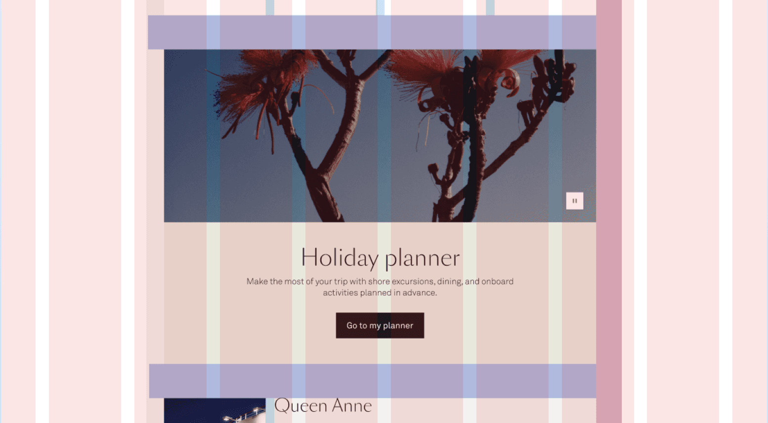
The structure stayed shared.
The experience adapted around it.
09 - FOUNDATIONS
Separate what something means
from how a brand expresses it.
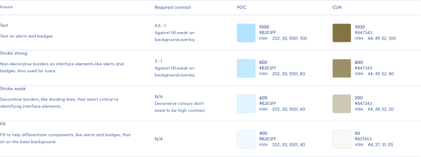
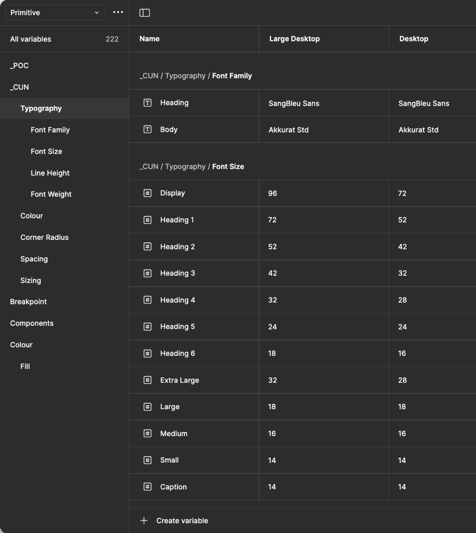
Instead of tying components directly to fixed styles, we separated foundational values from their meaning in the interface.
RAW VALUES
#173A87
#B2E3FF
#1D1D1B
#847343
PRIMITIVES
B1/ Primary/ DeepBlue/ 1000
B1/ Primary/ SkyBlue/ 1000
C1/primary/black/1000
C1/primary/gold/1000
SEMANTICS
B1/ Text/ Strong
B1/ Text/ Secondary
C1/Text/Strong
B2/Text/Secondar
So instead of a component depending on a specific colour, it could use something like
Text/ Strong
Each brand could then define what action-primary looked like without needing another version of the button.
This gave us a shared foundation while
leaving room for each brand to feel different.
10 - SPACING & HIERARCHY
Build the pattern once.
Reuse it where it belongs.
With the foundations in place, we consolidated repeated UI into shared components that could work across products, brands, and screen sizes.
SHARED BEHAVIOUR
Keep structure and states consistent.
Buttons, inputs, selectors, and cards shared the same interaction rules so similar tasks behaved the same way across products.
Buttons
Primary
Hover
Disabled
Secondary
Hover
Disabled
Text field
Enter your email
Dropdown
Select an option
⌄
Status chip
Active
Tabs
Overview
Details
Activity
Settings
BRAND READY
Let tokens handle brand expression.
The same component could express different brands through tokens, without creating a separate version each time.
Brand A — Travel
Book a trip
→
Email address
alex.chen@example.com
Alpine Explorer
7 days · Switzerland
›
Brand B — Finance
Open an account
→
Email address
alex.chen@example.com
Premium Savings
Higher rates, more flexibility
›
REUSABLE AT SCALE
Use the same components across journeys.
Shared patterns scaled from forms and dashboards to tables, modals, and navigation, reducing repeated design and engineering work.
Home
Trips
Payments
Messages
Settings
Search destinations...
Filters
New trip
Destination
Status
Date
Actions
Santorini
Greece
Confirmed
12 Mar 2024
•••
Kyoto
Japan
Planning
4 Apr 2024
•••
×
Confirm your booking
You're almost there. Review your details before continuing.
Confirm booking
Cancel
Components carried the shared behaviour and structure, while tokens handled brand expression.
11 - SPACING & HIERARCHY
Less visual noise.
More room to focus.
Different spacing and typography choices across products made similar screens feel inconsistent. We introduced shared rules to make layouts easier to scan while keeping them flexible across devices.
01 - RELATED CONTENT
Keep related information together.
A consistent 32px spacing rule helped group related elements, making it easier to understand which information belonged together.
Passenger details
Full name
Alex Chen
Date of birth
12 Mar 1990
▣
▲
▼
32px
Contact information
Email address
alex.chen@example.com
Phone number
+61 412 345 678
02 - SECTION SEPARATION
Give different sections room to breathe.
Larger spacing, such as 64px on desktop, created clearer separation between different content groups. These values adapted to smaller screens.
Travel documents
Passport
JPG, PNG or PDF. Max 10 MB.
Upload file
Payment information
Card number
1234 5678 9012 3456
● VISA AMEX
03 - VISUAL HIERARCHY
Make the next action easier to find.
Consistent heading sizes, content widths and spacing made dense screens easier to follow. Teams could reuse the same layout rules instead of making new decisions for every screen.
Ready to book your trip?
Review your details and continue to secure your booking. You can still make changes before payment.
Continue to payment
→
Save for later
The result was a clearer visual rhythm across products, with fewer layout decisions left to individual teams.
12 - BAKED INTO THE SYSTEM
Accessibility. Documentation.
Governance.
The system needed more than components. It needed clear standards, shared guidance, and a way to evolve without drifting apart.
01 - ACCESSIBILITY
Button states
Primary
Focus
Disabled
Colour contrast
Aa
✓
14.2 : 1
Aa
✓
8.6 : 1
Aa
✓
7.1 : 1
Built in, not added later.
WCAG 2.1 AA requirements shaped contrast, typography, states, and component behaviour so teams did not have to solve the same accessibility issues repeatedly.
02 - DOCUMENTATION
Design system
Introduction
Foundations
Components
Patterns
Accessibility
Brand
Guides
Button
Variants
Primary
Secondary
Tertiary
Usage
One place to understand
the system.
We used Zeroheight to document component usage, variants, responsive behaviour, accessibility, and brand rules for design, engineering, and QA.
03 - GOVERNANCE
↗ ↘
Propose
New component
or pattern
Iterate
Monitor, learn
and improve
Review
Design, engineering,
QA and brand
↘ ↙
Approve
Add to the system
A clear way to evolve
the system.
Brand, design, engineering, and QA aligned on what should become part of the shared system, helping new product needs get added without bringing fragmentation back.
Together, these practices helped the system stay usable, understandable, and sustainable.
13 - DESIGN TO DEVELOPMENT
Shared definitions
reduced interpretations
A stronger component and token structure also improved handoff.
Design and engineering could refer to the same component behaviours, states, spacing, and naming instead of recreating intent from static screens.
This made implementation more consistent and made QA easier because expected behaviour was clearer.

14 - OUTCOME
More reuse.
Fewer repeated problems.
More reuse meant less rebuilding, fewer inconsistencies, and a smoother path from design to implementation.
82%
Component reuse across journeys
Before: 34%
↓45%
Design-related QA bug backlog
100+
Components available through the system
MY REFLECTIONS
A design system is a shared product language
The biggest lesson from this work was that inconsistency rarely comes from one large mistake.
It comes from hundreds of small decisions being made independently.
A useful design system reduces the number of decisions teams have to remake while still giving products room to adapt.
Shared rules created more freedom, not less.

This site is laid out for a large screen. Open it on a desktop for the full experience.
sanjeev97ojha@gmail.com