Enter Password
Work / Mastercard analytics platform
Helping analysts make
decisions without waiting
for every
evaluation to finish.
An evaluation could take 8–10 hours to complete. During that time, analysts had limited visibility into the results being generated. Starting another evaluation also made previous work harder to revisit, while exploring a different KPI could mean running the entire
evaluation again.
KEY OUTCOMES
Observed behavior
Earlier decisions
Analysts could decide when a promising strategy was useful enough to inspect or act on, without waiting for the full run.
Exploration
1 run
Could support multiple analytical views through Custom Sorting.
Continuity
Versioned
Previous runs stayed readable and re-runnable without overwriting history.

As part of Mastercard’s Product Experience team, I worked on several features to streamline this experience. This case study focuses on three connected improvements.
Together, they helped analysts inspect results earlier, revisit previous evaluations, and explore existing strategies from different perspectives.
01
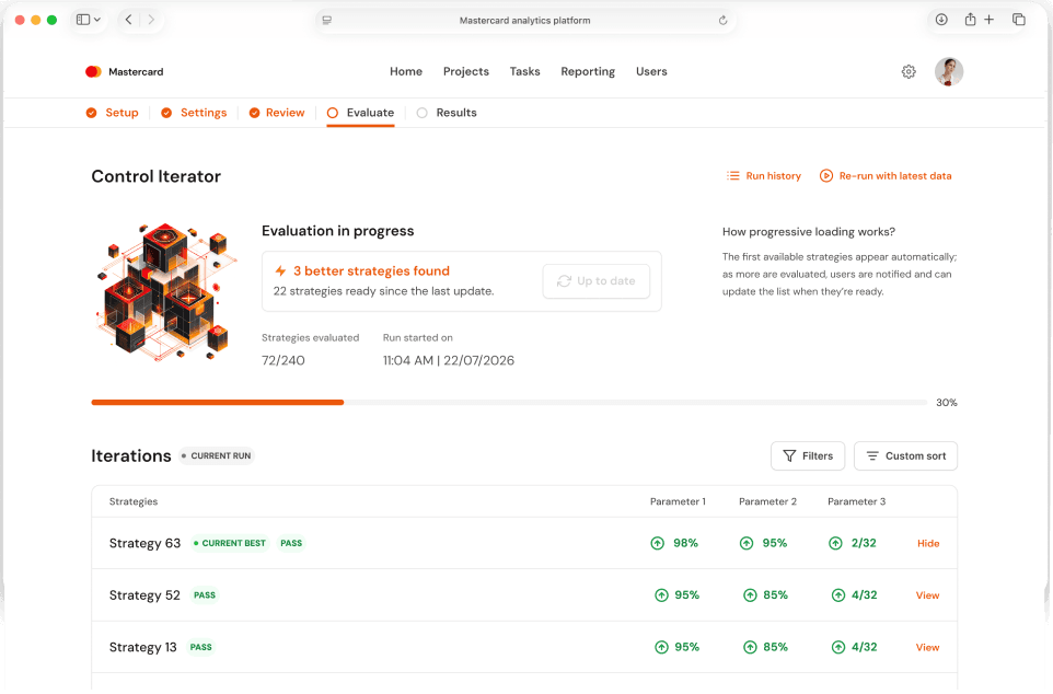
Progressive Loading
See useful strategies before the evaluation finishes.
02
Custom Sorting
Explore the same strategies through different KPIs and views.
03
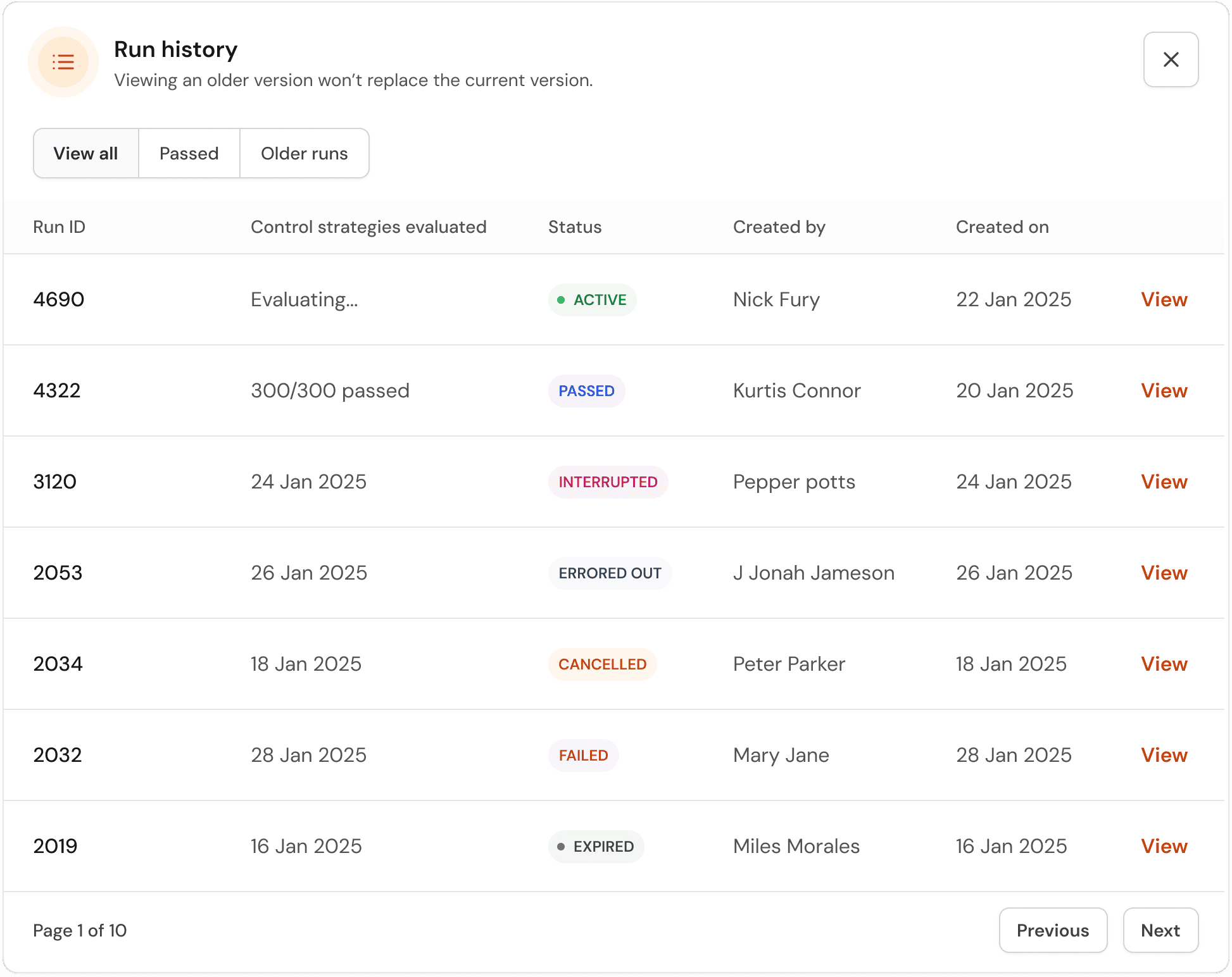
Run History
Return to an earlier evaluation without losing the current run.
ROLE
Senior Product Designer
TIMELINE
Nov 2025 – Aug 2026
CONTRIBUTION
Framing · interviews · interaction design · prototyping · accessibility · stakeholder/CX review · grooming · handoff · QA · post-release learning.

Evaluation in progress
Strategy inspection
Evaluation completed
Custom sort
Run history


01 - Two-minute version
Making long-running evaluations
more flexible, visible, and easier to revisit.
PROBLEM
Runs could take 8–10 hours. Results remained hidden until completion, previous runs were difficult to access, and changing the analysis often
meant rerunning.
OUTCOME
Analysts could inspect partial results, recover earlier runs, and change how strategies were ranked without starting another evaluation.
MOVE
Designed Progressive Loading, Run History, and Custom Sort to give users earlier visibility, recoverable evaluations, and greater control over existing results.
CONSTRAINTS
Irregular strategy generation, ranked results, multiple connected applications, performance limits, and established design-system components.
02 - Problem space
The system was doing its work.
Users couldn’t always do theirs.
The platform helps analysts evaluate large sets of strategies against different performance measures and business requirements.
Some evaluations could run for 8–10 hours and generate hundreds of strategies. Analysts then needed to inspect those strategies, compare their performance, generate Results, or adjust their study.
However, three parts of the workflow made that process harder than necessary.
These issues were connected. The platform supported complex analysis, but the experience assumed users would wait for completion, inspect one run, and follow a fairly fixed path through their results.
01 / Opaque during the run
Useful results stayed hidden until the evaluation finished.
Users could spend hours waiting before discovering whether the emerging strategies were worth exploring.
02 / Weak continuity over time
Starting again meant losing easy access to previous work.
Analysts relied on screenshots and exports to preserve earlier results and settings.
03 / Rigid after completion
Another analytical question could become
another expensive run.
Users sometimes had to revisit Settings, change the configuration, just to evaluate the same strategies from another angle.
AVERAGE RUN DURATION
8-10 hrs
Long enough that waiting itself became part of the
experience.
SCALE
500 strategies max
Large enough that ranking, scanning, and state clarity
mattered.
GENERATION CADENCE
Irregular
Polling could return one strategy or many; average roughly
one every 30 seconds.
USER BASE
New → power
The product had to support orientation without constraining
expert behavior.
03 - UNDERSTANDING THE USERS
One platform.
Three levels of confidence
The most useful distinction was not job title. It was familiarity with the product, frequency of use, and how deeply someone needed to interrogate an evaluation.
01
New users
Still learning how evaluations behave, what a
strategy represents, and which signals matter.
Primary need
Orientation
Main risk
Misreading state
02
Intermediate users
Comfortable with the workflow, but vulnerable to repetition, context loss, and unnecessary reruns.
Primary need
Efficiency
Main risk
Repeated work
03
Power users
Frequent users comparing runs, challenging defaults, and using evaluation history as part of decision-making.
Primary need
Control
Main risk
Rigid defaults
The friction appeared at different moments.
The lifecycle connected it.

The opportunity: make an evaluation legible while happening, flexible after finishing, and recoverable when users return.
04 - PROGRESSIVE LOADING
Feature -01
Why wait eight hours to see
if you’re heading in the right direction?
Problem
“Is it working, and do I need to keep waiting?”
Users could start a run, come back later, and still have very little meaningful feedback.
System constraint
Progress was irregular.
Polling could return one strategy or dozens. Average cadence was roughly one strategy every 30 seconds.
Design principle
Expose value without creating instability.
A constantly mutating feed would feel live, but make focused inspection harder.

While exploring with engineers how the system actually worked we discovered that fully evaluated strategies became available progressively. They did not all appear together at the end. However, the number available at each update was unpredictable.
The question was when the system should take over and
when users should stay in control.

Pin strategies during updates
Pin strategies as & when they arrive, but risk anchoring users to early choices.

Update the list automatically
Show new strategies instantly, but risk disrupting the list during review.
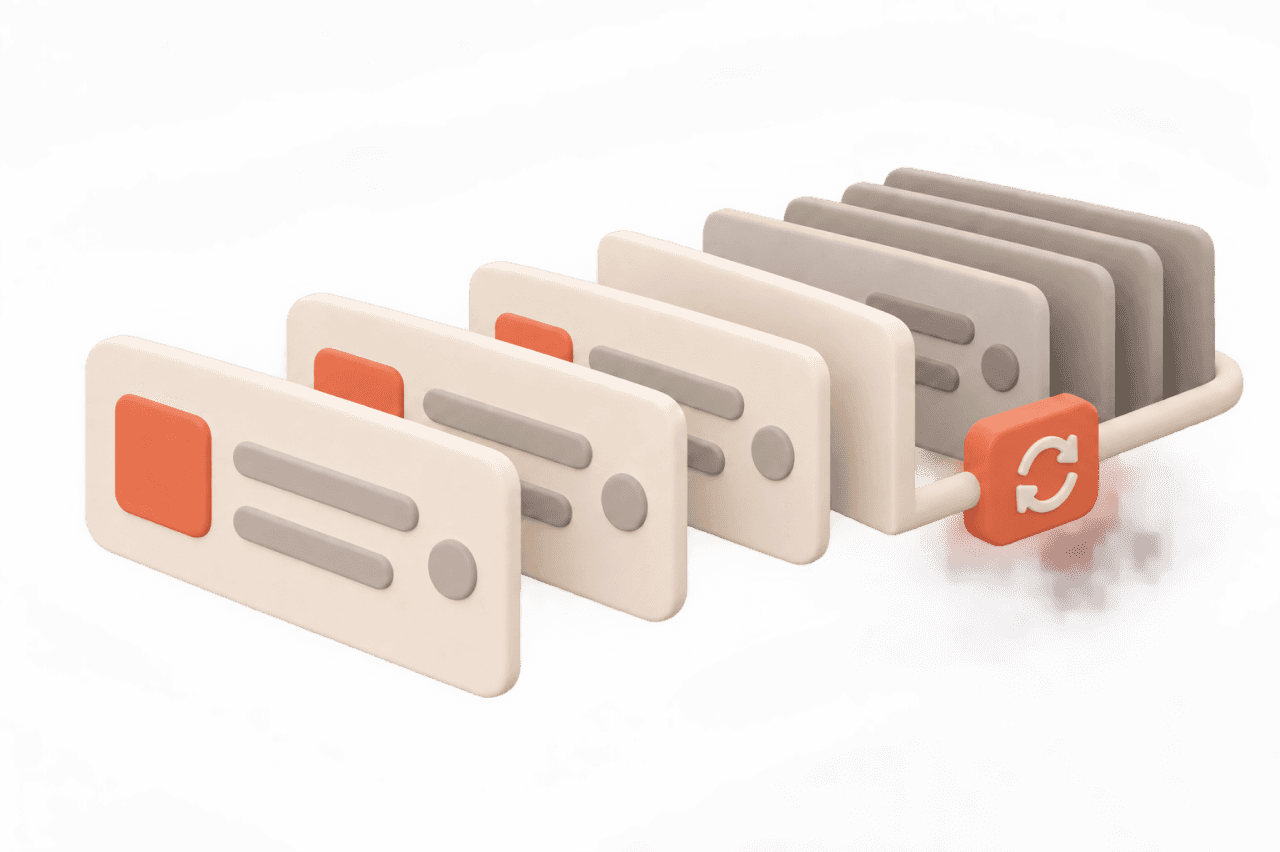
Selected
Automatic first batch, manual thereafter
Show initial strategies automatically, then let users choose when to update list.
05 - OUTPUT
Automatic when
there's nothing to lose.
Manual when context matters.

Start the evaluation
Computation begins. The first available
strategies appear automatically.
Inspect partial results
The analyst can review strategies while
the remaining evaluation continues.
New strategies become available
The system displays a notification
without disturbing the current list.
Inspect partial results
The analyst chooses when to bring the
latest strategies into view.

Current best vs Recommended
The final Recommended strategy could not be identified while the evaluation was still running.
We introduced Current Best to identify the strongest strategy among those evaluated so far.

CURRENT BEST - ONGOING RUN

RECOMMENDED - COMPLETE RUN
The distinction mattered. Current Best was provisional and could change as more results arrived. It also did not guarantee that the strategy had passed every required criterion. Once the evaluation finished, the Recommended strategy could be a different strategy than the last current best.
Edge cases and design decisions
What if no strategies are available at 0%?
After release, we learned that some users still assumed they needed to wait until the evaluation progressed much further. We added clearer contextual messaging to explain that strategies would
appear progressively.

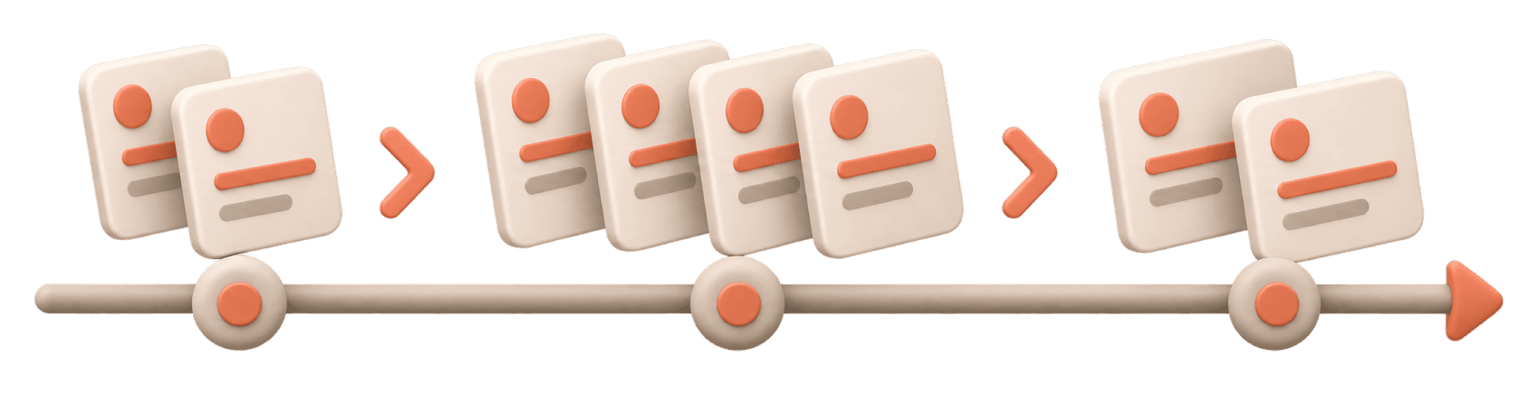
What if strategies arrive in
unpredictable batches?
Polling could return varying numbers of strategies, so the interface could not rely on a fixed update cadence or promise a particular number of results at each stage.
What if the evaluation fails or is stopped?
Previously generated strategies needed to remain available where possible so users would not lose useful work simply because the evaluation had not finished.

Design for scale
Some connected applications could not reliably preserve the manually held strategy list. Rather than create inconsistent behaviour, returning could expose the latest evaluation state.

What we learned after release
Follow-up research with 12 users showed a change
in how people approached completion.
Some stopped evaluations early when the emerging strategies looked unpromising. Others generated Results once they had something useful, without waiting for the remaining computation.
Users also began asking for clearer information about how much of the full strategy set had been evaluated. That led to progress context such as 44 of 200 strategies evaluated.
We didn’t make the computation faster. We made waiting for it less necessary.

06 — RUN HISTORY
Feature 02
What happens when you need to
revisit an earlier decision?
Problem
Every rerun made previous work harder to access.
Analysts relied on screenshots and exports to preserve evaluations they might need later.
System constraint
Runs were independent, not versions.
Each evaluation generated its own strategies. Loading detailed historical information also affected performance.
Design principle
Make previous work easy to find, not harder to manage.
Keep history simple. Let users find a run, reopen it and inspect its details in Evaluation.

We studied how six users revisited and saved previous work through scheduled and asynchronous feedback.
We also reviewed the legacy experience and
consulted engineering.
We found that evaluations were independent runs,
not versions.
This shifted our focus from version history to
recovering individual evaluations.
From a detailed history to a simple index
Early concepts included run IDs, creators, timestamps, statuses, strategy counts, significance information and system values. Testing revealed two distinct jobs:
Recognising a run
Finding the evaluation someone wants to reopen.

Analysing a run
Inspecting its strategies and detailed results.

Trying to support both inside the history view added unnecessary complexity. It also increased the amount of historical information the platform would need to fetch.
07 — THE SOLUTION
Find a previous run.
Pick up where you left off.
Open Run History
View current and previous evaluations in one place.
Find the right run
Use timestamps and status labels to identify the
evaluation you need.
Revisit your evaluation
Reopen a previous run to inspect its strategies,
settings and results.
Keep your current run intact
Explore earlier work while your current evaluation
continues. Expired runs remain viewable but require
a fresh evaluation for new Results.

Edge cases and design decisions
An older run is still valid
Analysts could reopen it and use its results for downstream work.

A run has expired
It remained inspectable, but generating new Results required a fresh evaluation using current data.

Current run is still ongoing
Analysts could inspect an older evaluation without stopping the current one.

Someone refreshes or returns from Results.
The product returned to the Current Run. We kept this behaviour consistent rather than preserving historical selection only along certain navigation paths.
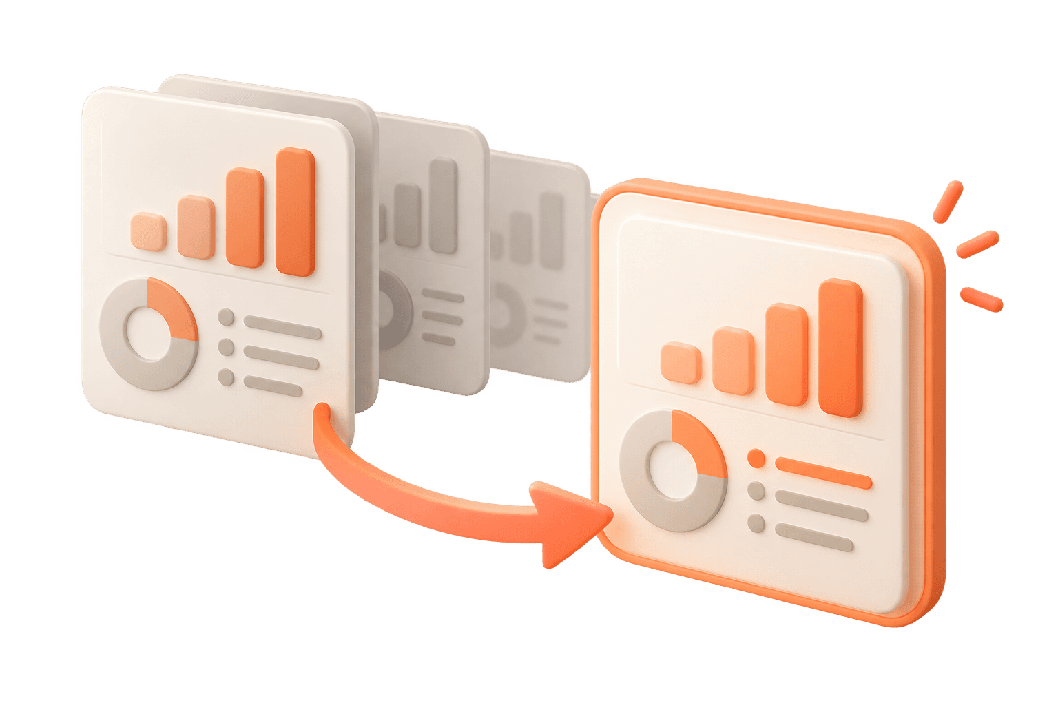
A user wants to pin
an important run
We considered pinning but did not include it. The expected number of historical runs was relatively small, and research did not justify the extra management feature.

What we learned after release
Run History was not intended to become an
everyday destination.
Its value appeared when an analyst needed to revisit a previous decision, compare directions, reuse earlier work, or respond to changing client requirements.
After release, feedback also highlighted some confusion about the ordering of runs. We addressed this through clearer help content rather than adding more controls.
Starting another evaluation no longer had to mean losing the way back.

08 — CUSTOM SORT
Feature 03
Why rerun an evaluation
just to ask a different question?
Problem
Changing the perspective meant starting again.
Exploring a different KPI could send analysts back to Settings to reconfigure, rerun and wait.
System constraint
More control introduced more complexity.
Sorting by multiple KPIs required additional priority rules and risked turning Evaluation into another Settings page.
Design principle
Change the view, not the evaluation.
Let analysts select one KPI and one sorting parameter to reorder existing strategies without another run.

Evaluation already had several controls, so adding more risked making it another Settings page.
We explored sorting options with users, from simple parameters to multiple KPIs.
Multi-KPI priorities added complexity for both users and engineering.
This simplified the focus of the MVP to one parameter one KPI method.
09 — THE SOLUTION
One KPI. One parameter.
Same evaluation.
Choose a perspective
Select one KPI for the question being explored.
Choose a parameter
Pick one value to order the existing strategies.
Apply Custom Sort
Reorder the list without generating new strategies.
Keep filters independent
Filter the set first, then sort the remaining strategies.

Custom Sort changed the view, not the evaluation
Custom Sort let analysts change how existing strategies were ordered without generating new ones or rerunning the evaluation.
A focused modal
The experience used a modal, which also helped keep the main Evaluation interface focused.
01
Filters stayed independent
Analysts could first remove strategies that failed an unwanted condition, then reorder the smaller set according to the KPI and parameter they wanted to investigate.
02
Recommended and Current Best kept their original meaning. If a user-selected sort moved the Recommended strategy lower in the list, its label stayed with it. The sorting order represented the analyst’s current perspective, not a change to the underlying evaluation.
Edge cases and design decisions
What happens to Recommended
after sorting?
Recommended and Current Best kept their original meaning. If a user-selected sort moved the Recommended strategy lower in the list, its label stayed with it. The sorting order represented the analyst’s current perspective, not a change to the underlying evaluation.
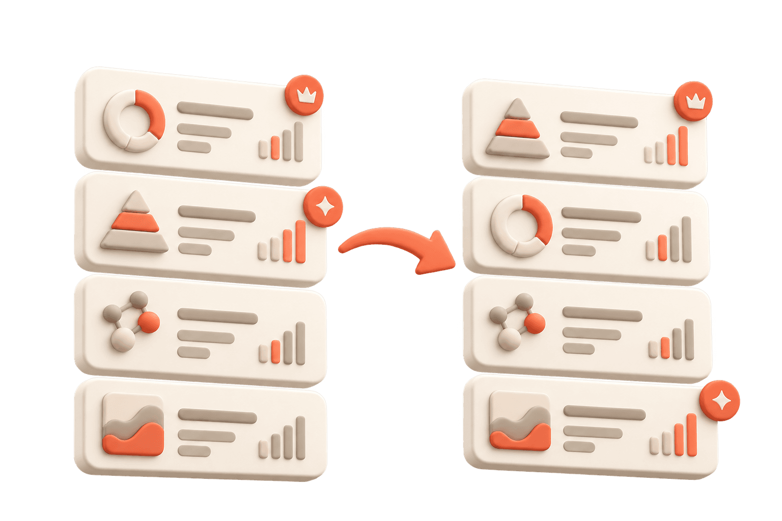
What if a filter is already applied?
Custom Sort worked on the remaining strategies. Filtering changed which strategies were visible; sorting changed their order.

What if several KPIs matter?
Multi-KPI prioritisation was explored but excluded from the MVP. It required more decisions from users and more complexity in how rankings were calculated.
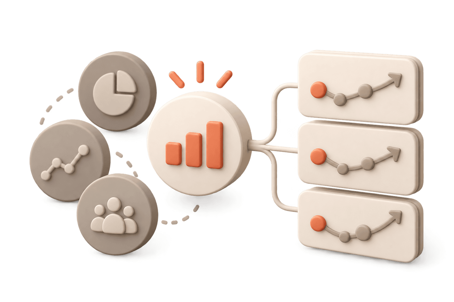
Should sorting start another evaluation?
No. Custom Sort changed only the presentation of strategies that had already been evaluated.

What we learned after release
After release, users reported less back-and-forth with Settings when investigating different KPIs.
Analysts could respond to new questions by changing the current view instead of automatically creating another run.
One observed workflow combined filtering and sorting: users first narrowed the set of strategies, then reorganised the remaining options around the KPI and parameter they cared about.
The perspective changed.
The evaluation didn’t.

10 - OUTCOME
Less waiting.
More control.
A smoother path from evaluation to decision.
01 — Earlier decisions
Progressive Loading
Analysts could inspect partial results, stop unpromising runs early, and generate Results without waiting for the full evaluation.
02 — Recoverable work
Run history
Previous evaluations became accessible, reducing the need for screenshots and manual exports.
03 — Flexible exploration
Custom sort
Analysts could explore different KPIs using existing strategies instead of running another evaluation.
These are qualitative outcomes from the research and post-release feedback. They are not quantified time savings or conversion improvements.
MY REFLECTIONS
The biggest improvement wasn’t adding more features. It was giving users more control.
This work taught me to understand the system before designing solutions, simplify complex interactions, and treat edge cases as part of the core experience.
Across all three features, the goal was the same: help analysts spend less time managing evaluations and more time making decisions.
This site is laid out for a large screen. Open it on a desktop for the full experience.
sanjeev97ojha@gmail.com