Work / Online check-in
Redesigning check-in
around how families actually travel.
Online Check-in asked guests to complete a long set of travel requirements before their cruise. The experience was rigid, repetitive, and difficult to manage, especially for families checking in several people at once.
KEY OUTCOMES
ONLINE CHECK-IN ADOPTION
65% → 85%
More guests completed Online Check-in before arriving at the terminal.
CHECK-IN COMPLETION TIME
~25 mins → ~10 mins
A simpler, more flexible journey helped guests complete check-in faster.
SUPPORT QUERIES
~38 → <11 per 100 guests
Clearer guidance and fewer blockers reduced the need for assistance.

ROLE
Experience Designer – Senior Associate
TIMELINE
June – October 2022
CONTRIBUTION
Research · UX Strategy · Interaction Design · Prototyping · Usability Testing · Handoff · Design QA
Home
Stay addresses
Payment details
Upload photo
Boarding pass

01 - Two-minute version
A smoother check-in experience built for
clarity, flexibility & confidence
PROBLEM
Guests were moving through a long, rigid journey with repeated information, unclear steps, and little freedom to stop or return.
OUTCOME
Online Check-in adoption increased from 65% to 85%,
while completion time dropped from roughly
25 minutes to about 10.
MOVE
Redesigned the flow around guest tabs, flexible navigation, smarter forms, clearer uploads, and a simpler finish.
CONSTRAINTS
Frontend-only changes, two cruise brands, family/group bookings, accessibility needs, and an existing backend we could not change.

02 - CONTEXT
Existing Check-in platform was becoming a part of the holiday stress
Cruise check-in required a lot of necessary information, but the experience made providing it unnecessarily difficult, especially for families and groups.
Abandonment also increased pressure on support and terminal teams.
The existing Online Check-in experience pushed people through a strict sequence. Leaving the flow, switching between guests, or correcting information could be difficult.

03 - CONSTRAINT
Improve the journey
without affecting the backend
The underlying systems and data requirements were already in place, and the project had to work within them.
FIXED
Constraints we worked within
Existing backend, data requirements and business rules.
FLEXIBLE
What we could redesign
Information, navigation, progress, feedback and the group check-in experience.

04 - RESEARCH
Finding the breaking points
where the journey was breaking down
Before defining the experience, we looked at how people were ordering food during the pandemic and what established food apps were already doing well.
Our research included:

UX audit of the existing journey

Guest feedback from cruise terminals and support tickets

Interviews with customer operations and service teams

Reviewed check-in across direct and indirect competitors.
This helped us see where friction was building across the experience rather than treating each issue separately.
05 - KEY FINDINGS
Three problems kept surfacing
and became impossible to ignore
Three themes shaped the product.
The flow was too rigid
Guests had to move through check-in in a fixed order.
If they were missing information, wanted to check something else, or needed to come back later, the product did not make that easy.
01
Important steps lacked context
Tasks such as uploading a photo or setting up required information did not always explain clearly what was needed or why.
People could reach a blocker without understanding what had
gone wrong.
02

Families repeated too much work
Group bookings made the problem worse. Information shared across several passengers could still need to be entered repeatedly, turning a long flow into an even longer one.
03
06 - MAPPING THE JOURNEY
Seeing the problem
end-to-end
We mapped the existing experience before redesigning it.
The journey showed where:
The information was repeated
Users felt stuck
Context went missing
Users had to move back and forth
Flow became difficult for groups & families


07 - DESIGN principles
Clearer.
Flexible. less repetitive.
Four principles guided the redesign.
Reduce cognitive effort
Show people what they need now instead of everything at once.
Give guests more control
Allow people to move through the journey without forcing
one strict path.
Respect the
booking context
A family checking in together should not feel like four unrelated people filling the same form four times.
Design for scale
The experience needed to work across devices and across both cruise brands.
08 - EXPLORATIONS
We tested
three different ways to structure check-in
We tested the concepts using high-fidelity Figma prototypes.
Participants checked in three guests while we measured time, errors, clarity, passenger switching, and completion confidence.
Single page with guest tabs
Keep the journey together and let users switch quickly between passengers.
Multi-step flow
Break check-in into smaller sequential steps.
Accordion layout
Keep everything accessible from one page while collapsing completed sections.
09 - WHAT TESTING CHANGED
People wanted to know
where everyone stood
One pattern became very clear.
Guest tabs gave them a simple way to move between passengers and understand progress without constantly entering and leaving separate flows.

Testing also showed that people valued being able to move around rather than feeling trapped inside a strict sequence.
That led us toward the single-page guest-tab model with flexible navigation.
10 - OUTPUT
Features we included
that supported this build
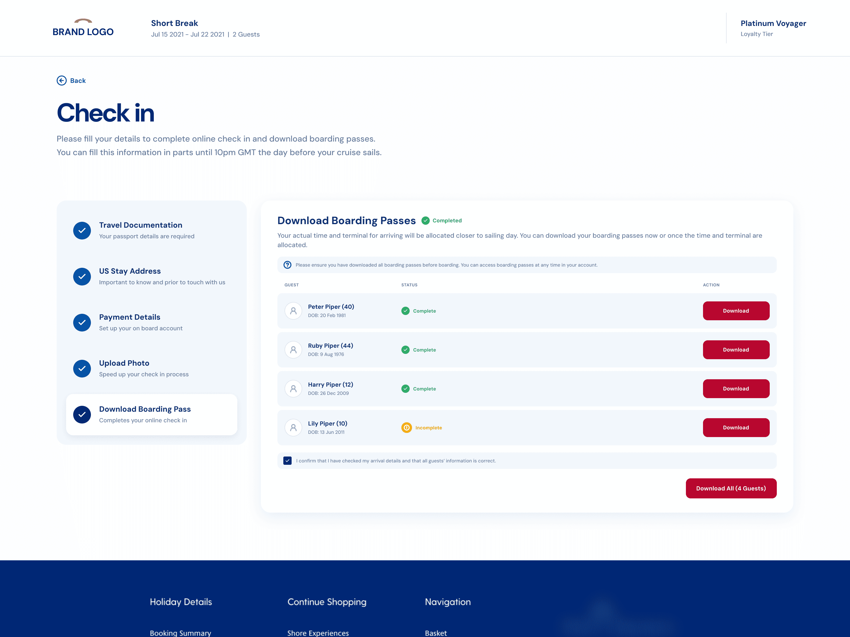
1. Smarter forms
2. Guest switching
3. Flexible navigation
4. Clearer payment setup
5. Smarter photo upload
6. Responsive design
7. Review & completion
01 - SMARTER FORMS
Enter shared information once
A large source of effort came from repeating information across passengers.
Instead of asking for the same information again and again, the redesigned experience could reuse shared details from the lead guest unless another passenger needed different information.



Change was simple, enter shared information once, change it only when necessary.
02 - GUEST SWITCHING
One booking, several people, one clear view
The guest-tab model made each passenger’s status visible from the same experience.
Guests could switch passengers, track progress, and resume unfinished sections without
losing their place.


That replaced a series of isolated passenger flows with something that felt like managing one booking.
03 - FLEXIBLE NAVIGATION
Check-in did not have to happen in one sitting
Not everyone has every document or detail ready at the same moment.
The redesigned journey allowed guests to move between sections, save progress, and return later.
That meant reaching a missing passport number or unfinished section no longer had to become a
dead end.


The system could show what remained while letting the guest continue with what they already had.
04 - CLEARER PAYMENT SETUP
Make payment requirements
easier to understand.
Payment setup needed clearer context around what was required, why it was needed, and whether the step had been completed successfully.

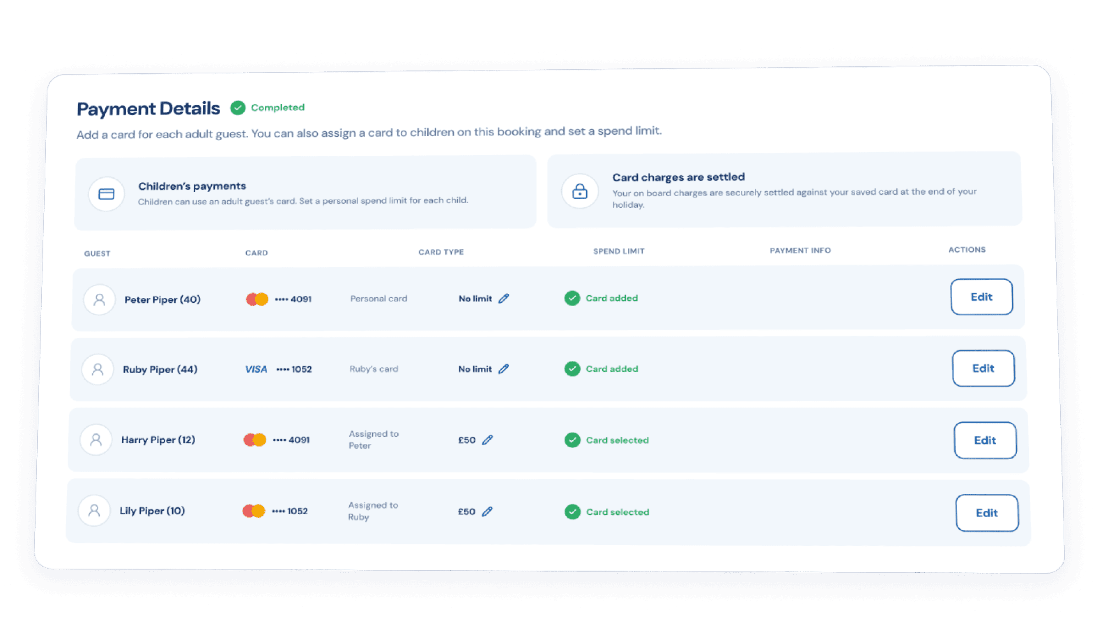
The redesigned experience made the state and next action more obvious, reducing uncertainty at a critical point in check-in.
05 - PHOTO UPLOAD
Make the requirement clear before
something goes wrong
Photo upload had been another source of confusion.
Guests needed clearer guidance on photo framing, quality, requirements, and acceptance.


The redesigned interaction explained those requirements earlier and gave clearer feedback during upload.
06 - RESPONSIVE DESIGN
The same journey, adapted to the screen
Online Check-in needed to work across different devices.
The layout therefore changed with the available space rather than simply shrinking.
On larger screens, more information could sit side by side.


On smaller screens, forms became more linear, actions remained easy to reach, and progress stayed visible without overwhelming the page.
07 - REVIEW & COMPLETION
Make the finish feel finished
Completing a long check-in journey should end with certainty.
Guests needed clear confirmation of completion, next steps, and boarding documents.


The final experience made completion status clearer and brought boarding information closer to the end of the journey.
11 - BEFORE & AFTER
Same requirements.
Less work around them.
The redesign did not remove important travel requirements.
It changed how guests moved through them.
Before
After
12 - OUTCOME
More guests completed check-in
and did it much faster
The biggest change was not that check-in suddenly required less travel information. It was that the product stopped making that information harder to provide than it needed to be.
85%
Online Check-in adoption
Before: 65%
~10 mins
Typical completion time
Before: 25 mins
<11 per 100 guests
Online Check-in adoption
Before: ~38 queries
MY REFLECTIONS
Flexibility was more valuable than making the journey look shorter
At the start, it would have been easy to treat this as a form-design problem. It wasn’t.
This wasn’t a form problem. Guests had different needs, so the redesign gave them more control while keeping requirements clear.
The lesson I took forward: simplify the path, not the reality behind it.


This site is laid out for a large screen. Open it on a desktop for the full experience.
sanjeev97ojha@gmail.com