Work / Taco Bell mobile ordering
Counters disappeared.
Cravings didn’t.
Designed a 0→1 mobile ordering experience for Taco Bell that makes it easier to browse, customize, order, and check out on mobile.
The goal was simple: help people go from craving to checkout without the experience feeling slow, confusing, or heavy.
KEY OUTCOMES
APP DOWNLOADS
~82K
In the first 17 days, strong early adoption following the launch of Taco Bell's mobile ordering app.
USER REVIEWS
~1.23K
Customers shared their feedback during the initial launch period.
AVERAGE RATING
4.7/5
Positive early feedback reflected a favourable response to the new ordering experience.
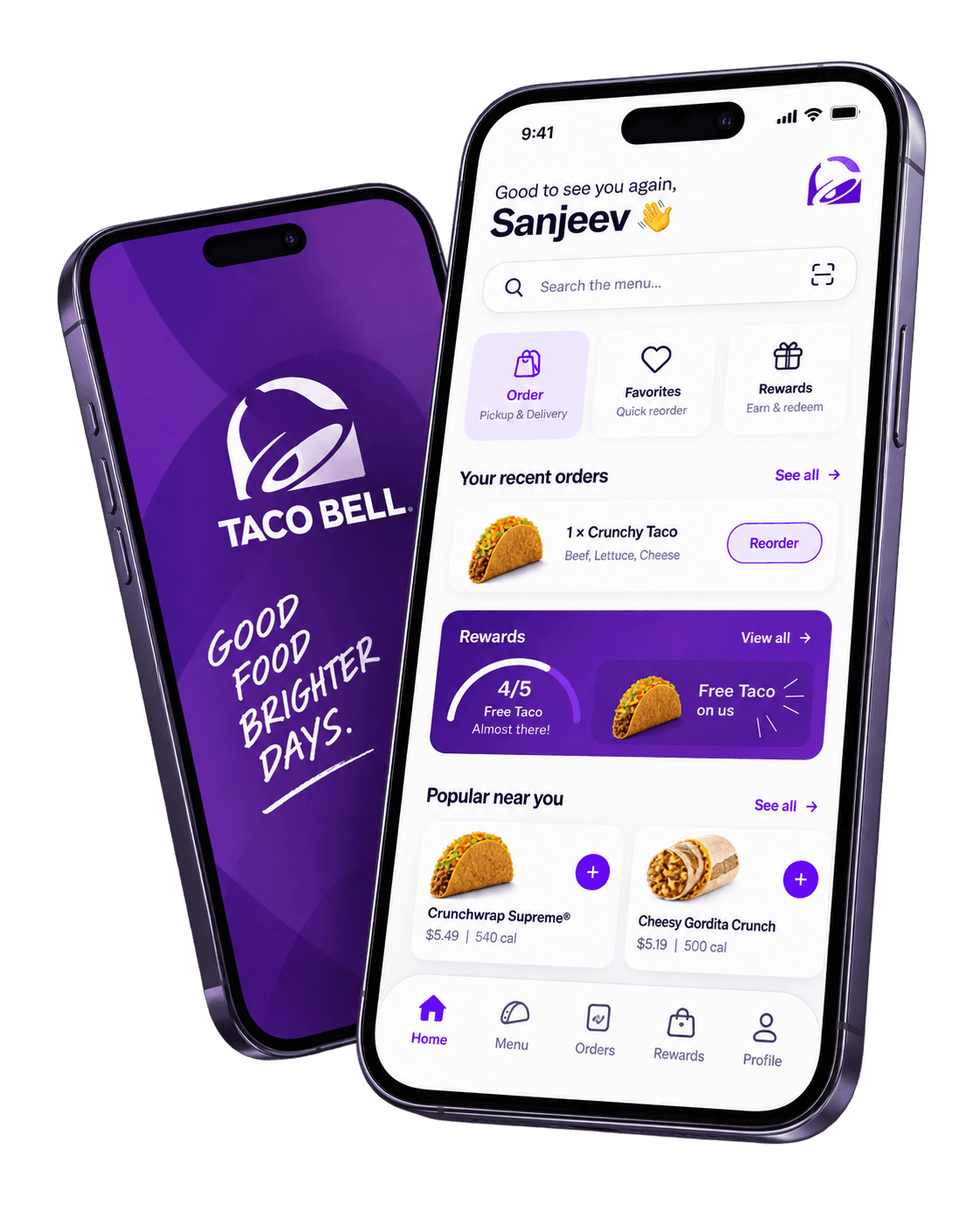
Just some snapshots what I would had
changed in the UI, this doesn’t adhere to
the official brand guidelines, but just out
of curiosity and too much coffee,
I just thought what if.

ROLE
UI/UX Designer
TIMELINE
June – August 2020
CONTRIBUTION
Product strategy · User research · Information architecture · UX design · UI design · Prototyping · Usability evaluation

Pre-login
Home
Menu
Customization
Cart
Order status
Rewards
01 - Two-minute version

A mobile ordering experience built for
speed, choice and ease
PROBLEM
COVID changed food ordering almost overnight. With foot traffic heavily affected, Taco Bell needed a way to support dine-in, takeaway, and delivery through one branded digital experience.
OUTCOME
~82K downloads in the first 17 days,
with ~1.23K reviews.
MOVE
Designed the 0→1 ordering journey from discovery to confirmation in June–August 2020.
CONSTRAINTS
Tight pandemic timeline, a highly customizable menu, multiple fulfillment modes, and the need to stay true to the Taco Bell brand.


02 - CONTEXT
Covid changed the way
people ordered food
Taco Bell had traditionally relied heavily on people visiting its restaurants.
Then COVID changed that behaviour quickly. Customers were moving toward delivery and takeaway, while food aggregators were becoming an even bigger part of the relationship between restaurants and their customers.
The challenge was bigger than simply putting the menu on a phone. The app had to make Taco Bell’s large, customizable menu easy to order while still feeling unmistakably like the brand.


03 - RESEARCH
What would make someone
use a brand app instead of an aggregator?
Before defining the experience, we looked at how people were ordering food during the pandemic and what established food apps were already doing well.
Our research included:
We also looked at the wider shift in food delivery during COVID and how restaurant brands were using offers, rewards, personalization, and direct ordering to build stronger relationships with customers.

Competitive reviews of products such as Domino’s, Chipotle, and Starbucks

Informal user conversations
& Social-media sentiment

Stakeholder discussions
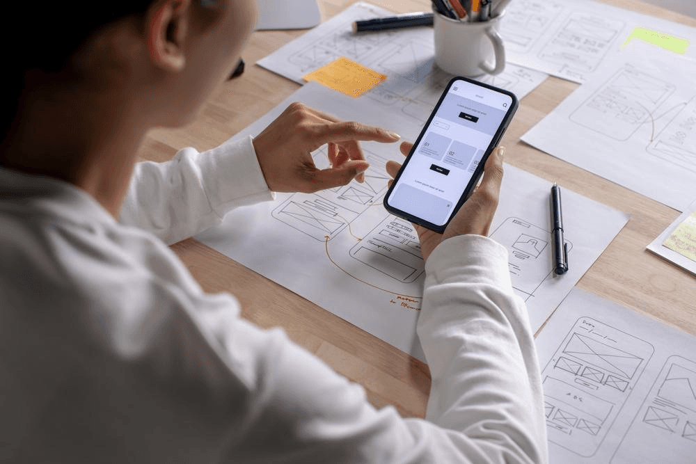
Prototype testing

04 - KEY FINDINGS
Speed mattered,
but so did having a reason to come back
Three themes shaped the product.

People wanted
ordering to feel quick
Ordering food is a short, goal-driven task. Every unnecessary screen or decision makes it feel slower.
We set a goal of keeping the happy path under roughly 2.5 minutes.
01
A brand app needed to offer something aggregators could not
Offers, loyalty, easier reordering, deeper customization, and a stronger Taco Bell experience could give customers a reason to order directly.
02
Customization had to remain simple
Taco Bell offers deep customization, but showing every option at once would overwhelm mobile users. The challenge was keeping choice without making ordering feel like a form.
03
05 - DEFINING THE JOURNEY
Defining the experience
before designing the screens
The flows aligned the team before UI design, especially as customer behaviour was changing quickly.
Onboarding flow

Ordering flow


06 - Product principles
Effortless.
Accessible. Clear.
Three simple principles guided the experience.
Effortless
Common tasks should require as little work as possible.
Accessible
The product should remain understandable and usable across different users and needs.
Clear
The interface should show what matters now instead of overwhelming people with every option at once.
07 - ONE EXPERIENCE
Small patterns,
repeated consistently.
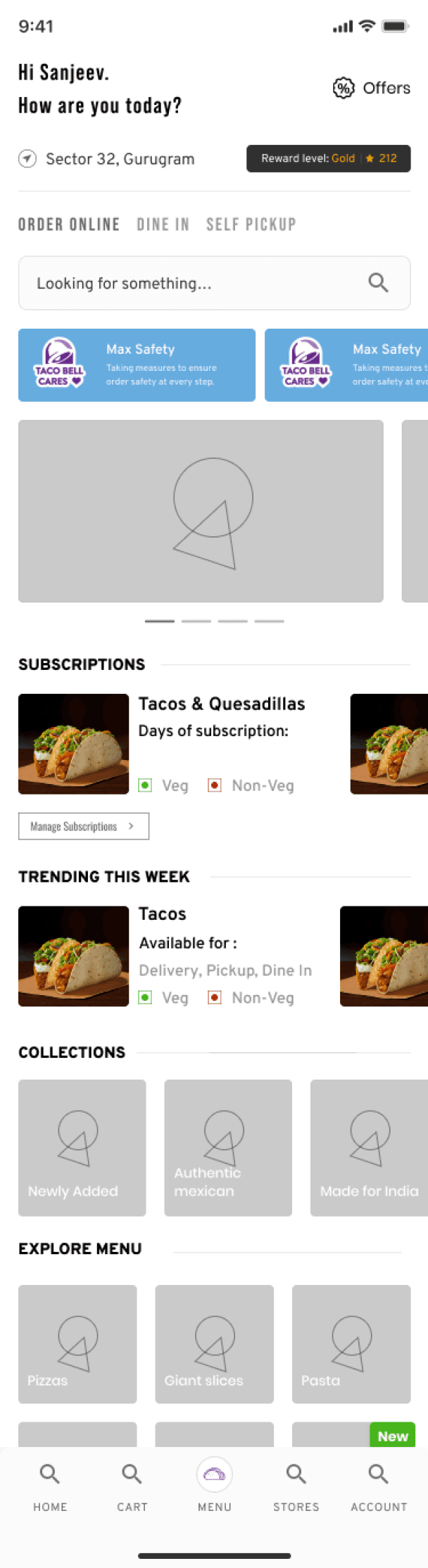
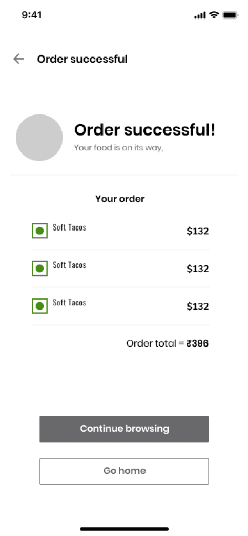
Across the app, we reused common patterns.
That consistency mattered because the product covered a long journey. The more familiar each interaction felt, the less people had to relearn as they moved through the app.
Across the app, we reused common patterns.
That consistency mattered because the product covered a long journey. The more familiar each interaction felt, the less people had to relearn as they moved through the app.






08 - PROTOTYPE TO LAUNCH
Testing the flow
before committing to the interface
Once the main structure was agreed, I built a high-fidelity prototype to test the complete ordering journey.

We focused on:
whether the flow was easy to understand
whether users could learn it quickly
how customization felt
how quickly an order could be completed
whether important information appeared at the right time
The feedback helped us simplify the flow before moving toward the final experience.
09 - OUTPUT
Features we included
that supported this build
Taco Bell offers deep customization, but showing every option at once would overwhelm mobile users. The challenge was keeping choice without making ordering feel like a form.
01 - RESTAURANT DISCOVERY
Let people know they can order before asking
them to sign up
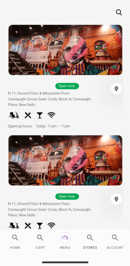
People could check nearby locations, opening information, and available services without first committing to account creation.


This reduced unnecessary friction at the start of the journey.
02 - FULFILLMENT
Choose how you want to order before you start browsing
Instead of waiting until checkout to discover whether an order could be delivered or collected, customers could make that decision before building their cart.

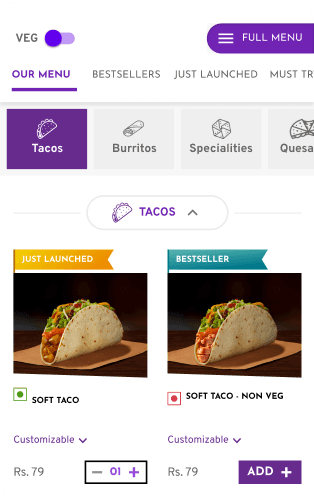
03 - MENU DISCOVERY
A large menu that still feels easy to explore
The goal was not to reduce choice.
It was to make a large menu feel manageable on a small screen.
04 - PERSONALISATION
Your order, without the overload
Customization is one of the most important parts of the Taco Bell experience.
Instead of exposing every decision at once, options were grouped into smaller, understandable sections. Visual references for ingredients helped make selections easier to understand.
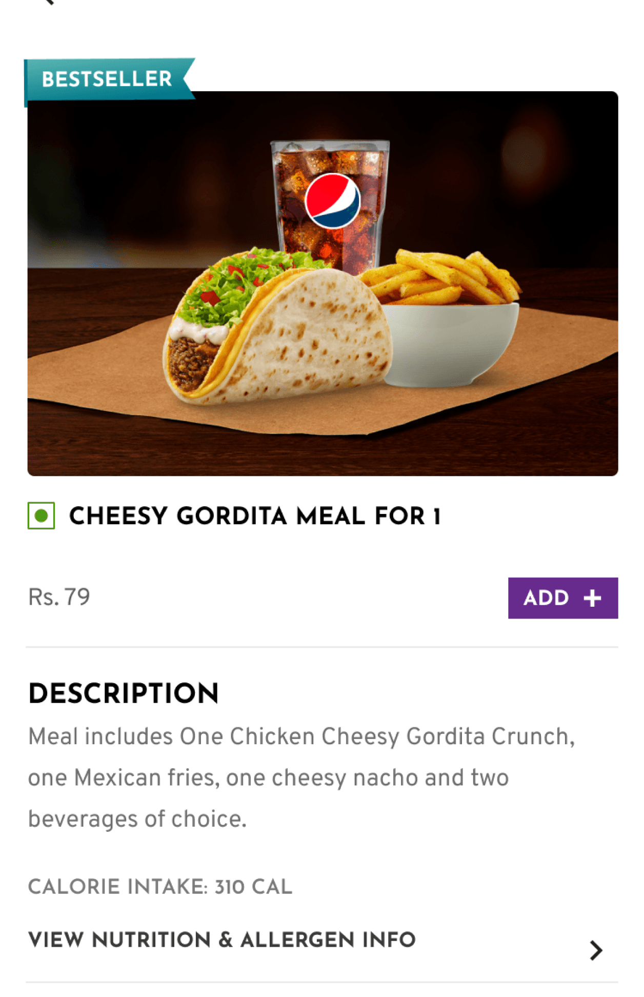

The result was a flow that kept Taco Bell’s flexibility without making ordering feel complicated.
05 - COME BACK TO YOUR FAVOURITES
“Recommended” + “Recently Ordered”
The goal was to reduce the friction between getting stuck with analysis-paralysis of what to eat every time you open the app and actually start building the cart.


07 - LOYALTY
Rewards inside the ordering experience
Loyalty stayed connected to ordering, making rewards easy to understand, track, and redeem without adding complexity.

08 - CART
Keep the final step focused
Checkout stays focused: review the order, confirm fulfillment and payment, apply rewards, and place the order.
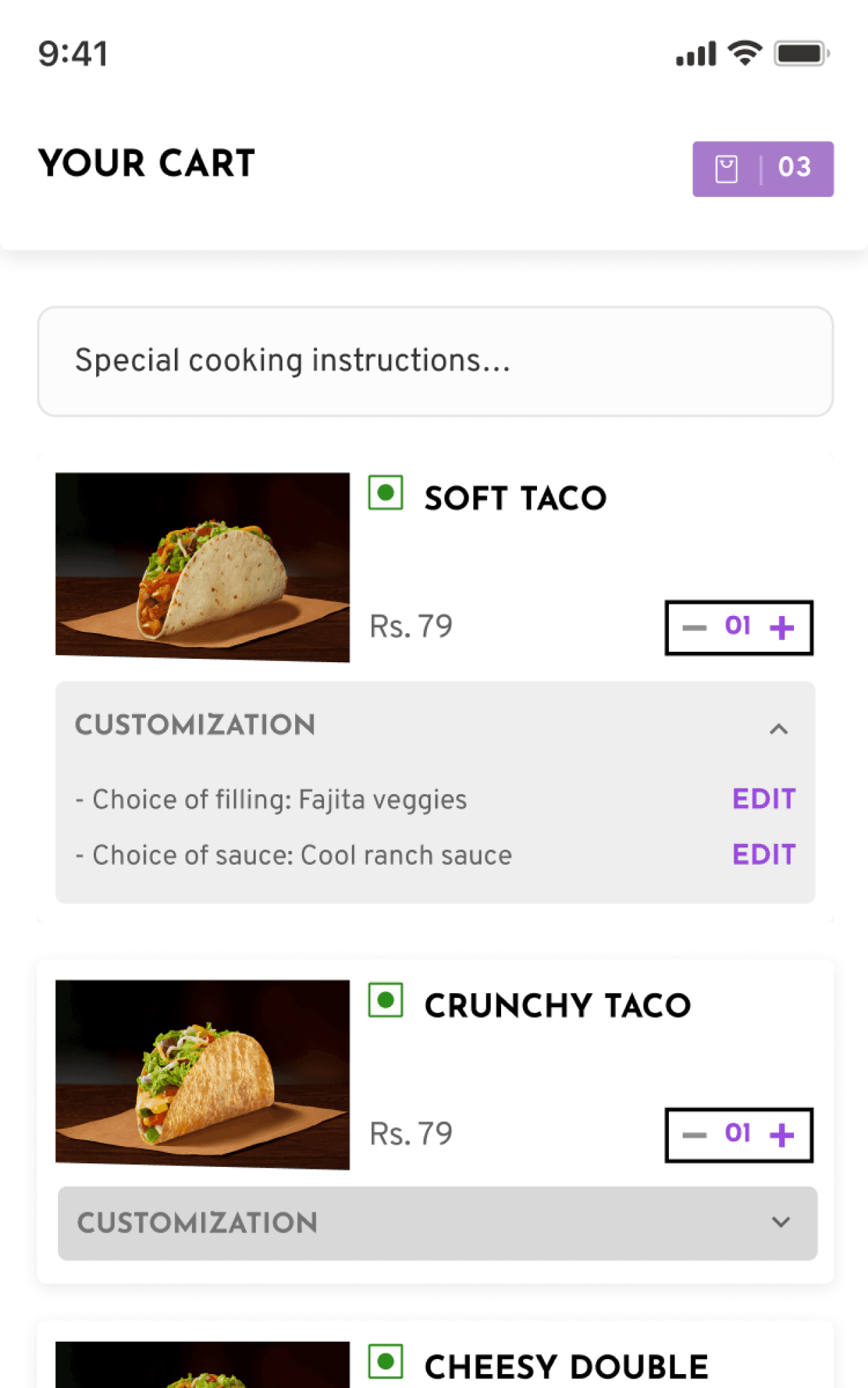
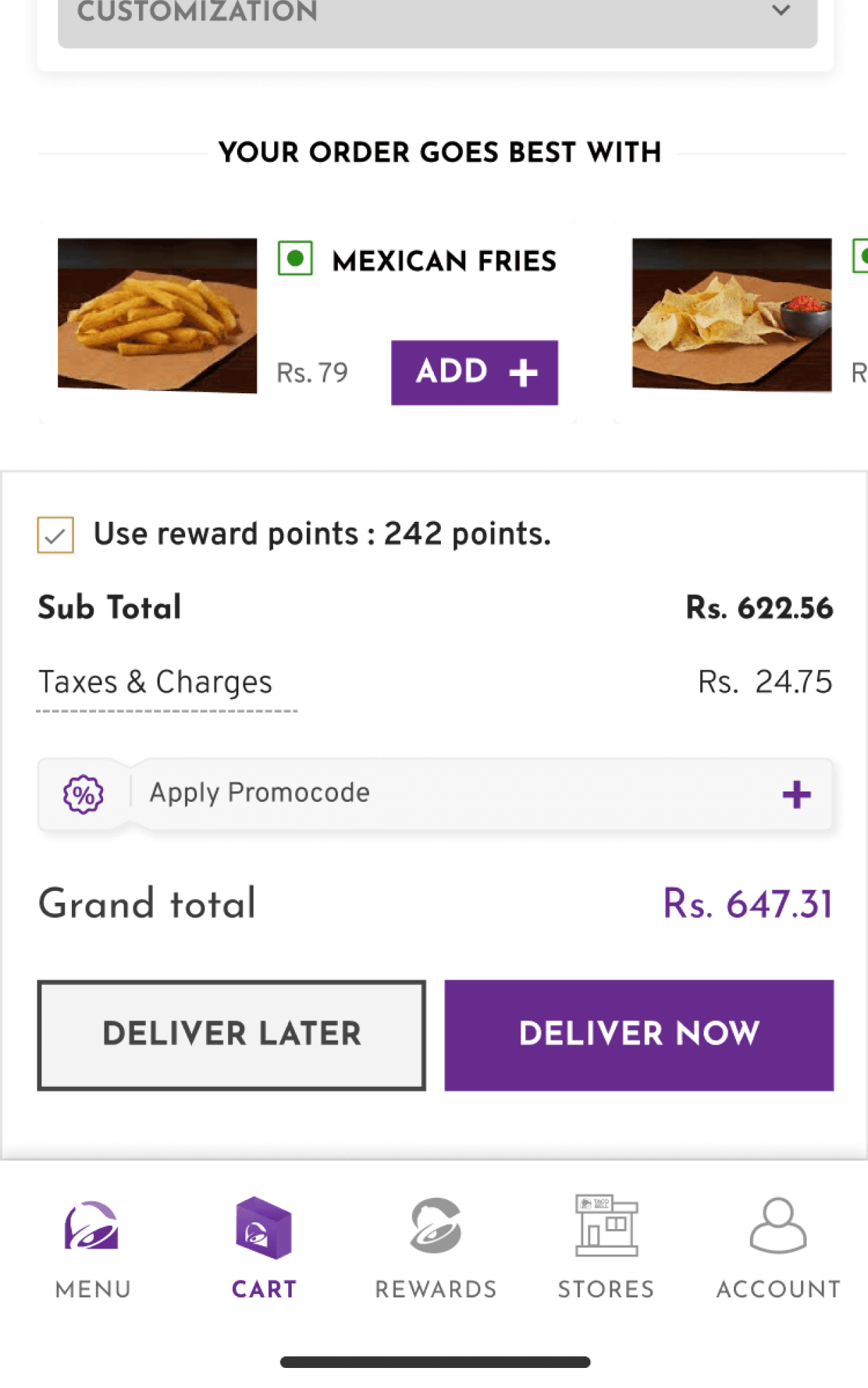
The interface keeps the final stage focused on the information needed to place the order.
09 - CONFIRMATION
Clear about what
happens next
After payment, confirmation keeps order details, delivery information, status, and support in one place.

10 - OUTCOME
82K downloads
in the first 17 days
The app launched during a period when Taco Bell’s relationship with customers was rapidly moving from restaurants to phones.
82K
Downloads in 17 days
1.23K
User reviews
4.7/5
Average raiting
The app launched during a period when Taco Bell’s relationship with customers was rapidly moving from restaurants to phones.
MY REFLECTIONS
Speed is not only
about fewer screens
This project changed how I think about speed in consumer products.
A fast experience is not simply one with fewer taps.
It is one where people:
→ know what to do
→ understand their choices
→ feel confident moving forward.

This site is laid out for a large screen. Open it on a desktop for the full experience.
sanjeev97ojha@gmail.com